MAGIC PHOTOBOOTH
Brand Design | Visual Identity | Web Design
Magic Photo Booth is an innovative endeavor spearheaded by entrepreneurs Robin Rocha and his partner, Alejandra. With a shared vision of delivering vibrant and engaging photo experiences, they aim to captivate customers with their unique offerings.
Impact: Strategically drove over 100+ user inquiries by implementing a defined brand strategy, enhanced by SEO optimization. Secured 3 bookings upon launch and amassed 100 followers on Facebook.
Roles
Brand Designer
Web Designer
Deliverables
Brand Strategy
Visual Identity
Style Guide
Website Design
Project Scope
Timeline: March 2024 - Present
Tools:
Figma
Adobe Illustrator
Adobe Photoshop
Square Space
GOAL
Premium Event Entertainment: Elevating Experiences
The primary goal of this design case study is to showcase the premium offerings of the business. These offerings include the Luxury Mirror photo booth, 360 Photo Booth, and LED dance floor, which are designed to elevate events to the next level. Additionally, the company provides a customized photo booth experience with custom editing features, along with photo printing packages to ensure a seamless experience for clients and their guests. Through this, we aim to highlight the unique features and high-quality services that set the business apart in the event entertainment industry.
PROCESS + RESEARCH
Deep Dive Consultation
I began by consulting with my clients, providing them with a questionnaire to delve into their business offerings, core beliefs, future aspirations, and target audience. This allowed for thoughtful responses ahead of our video call, where we further discussed their vision. This personalized approach laid the foundation for crafting their brand identity.
The work comes from down below.
Define Target Audience
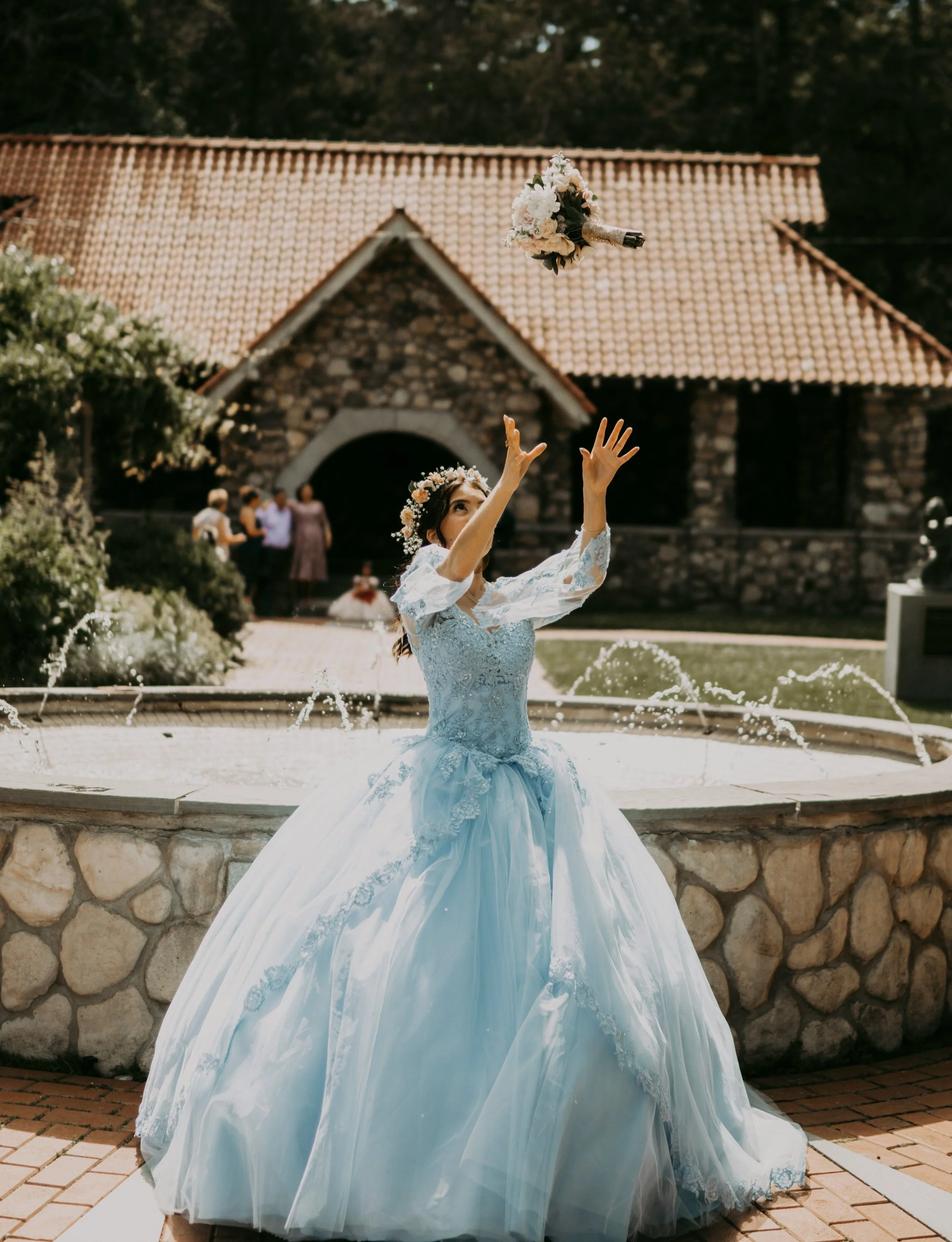
Comprising individuals who host Quinceañeras, upscale weddings, and corporate events, the company primarily focuses on residents in Colorado. However, it aspires to broaden its reach in the future.
COMPETITIVE ANALYSIS
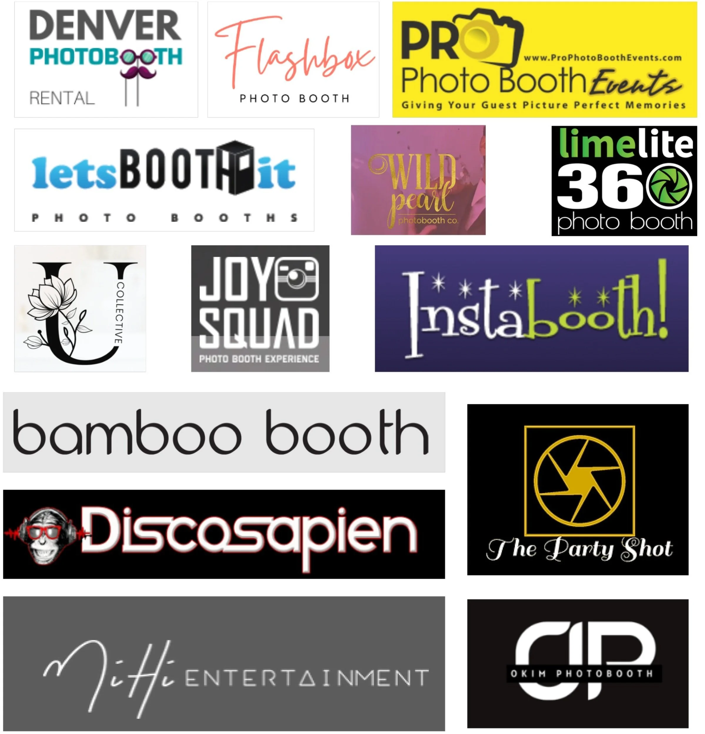
I conducted comprehensive research on all competitors within Magic Photobooth's target market area. Through this analysis, I meticulously examined various aspects, including logo designs, to discern overarching trends and distinctive features. By identifying key points of differentiation, I then strategized how Magic Photo Booth could position itself uniquely amidst the competition, aiming to carve out a distinct and memorable presence in the market.
Visual Trend Analysis
Simplistic Design: Leading companies in the industry favor simplistic designs, embracing clean and uncluttered aesthetics to prioritize clarity and straightforward communication.
Icon Association within Logotype: Brands often incorporate icons or symbols within their logotypes to enhance recognition and convey messages concisely. This trend adds depth and versatility to designs, contributing to memorable visual identities.
Logotype Font Styles: Font styles vary from bold and impactful to finely detailed and intricate, allowing brands to experiment with typography to express their unique personality and positioning. Whether bold sans-serif for a modern look or elegant serif for sophistication, typography plays a crucial role in defining brand identity and appeal.
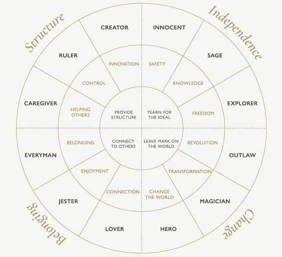
BRAND ARCHETYPE
Structured personality enhancing brand recognition
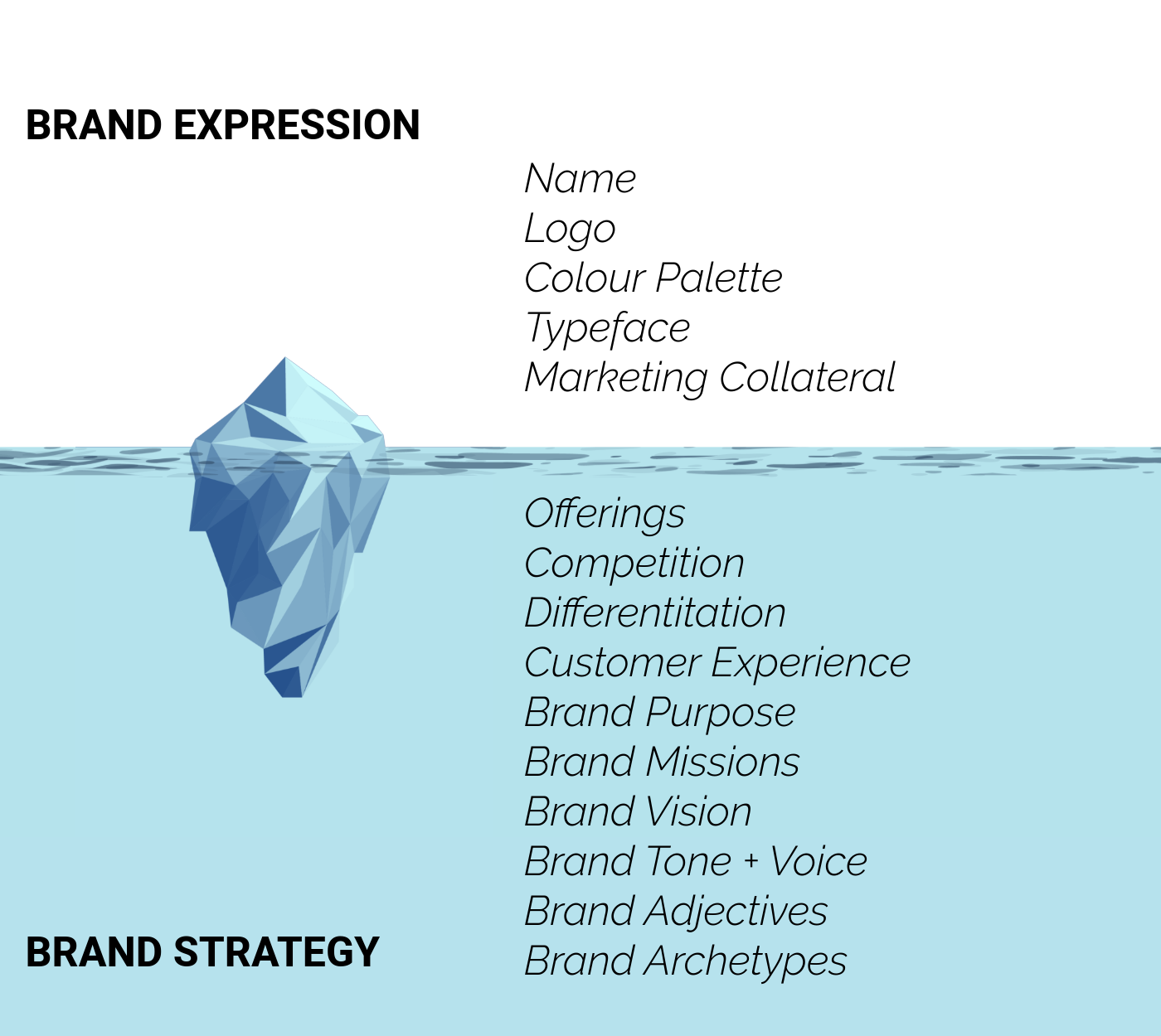
Then I defined a brand archetype rooted in my client’s brand values, this process facilitated the development of the brand identity design by providing a structured framework for shaping the brand's personality and essence.
Creates a unified visual language
Psychology based, fosters trust and differentiation with target audience.
Guides storytelling + communication strategies, conveys values
Enhances brand recognition, cultivates emotional connections, and contributes to sustained brand success.
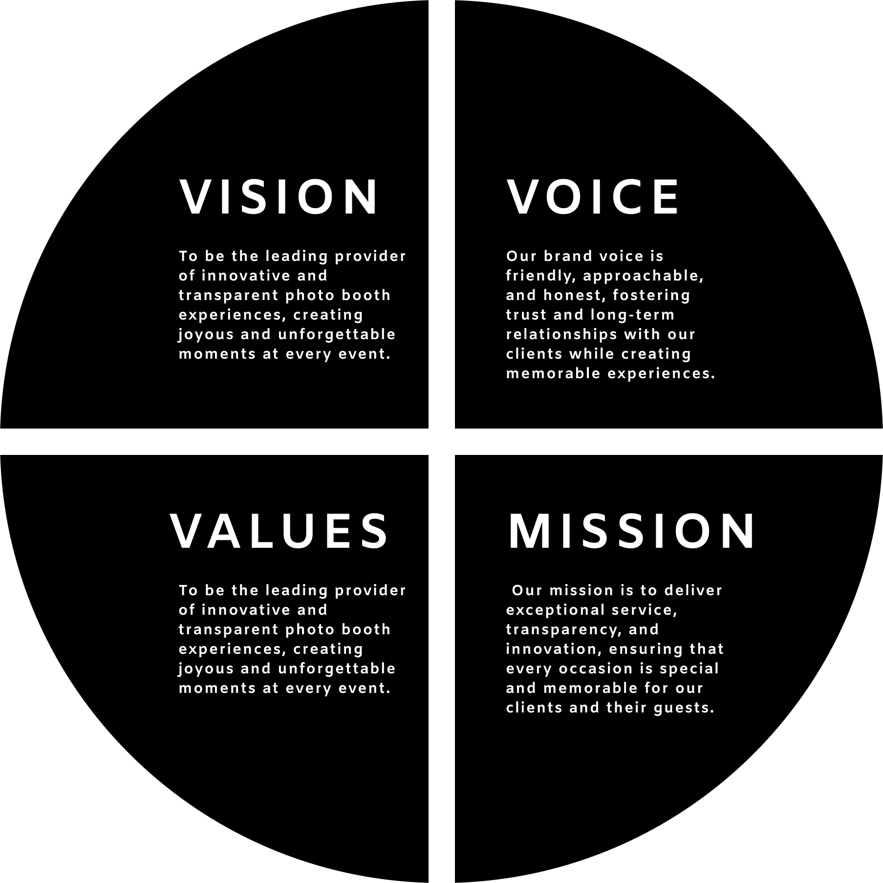
BRAND STRATEGY
VISUAL IDENTITY DEVELOPMENT
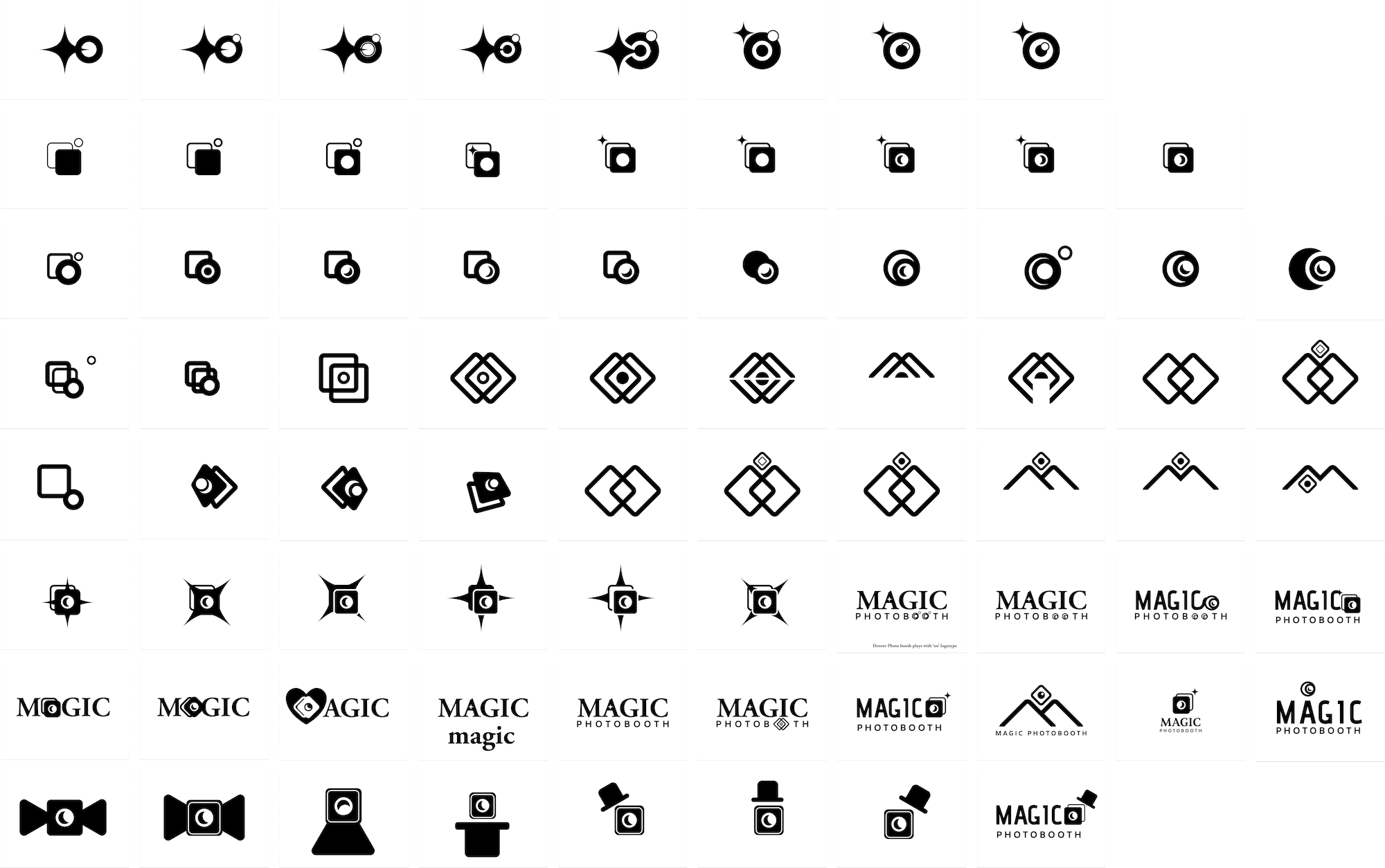
LOGO DEVELOPMENT
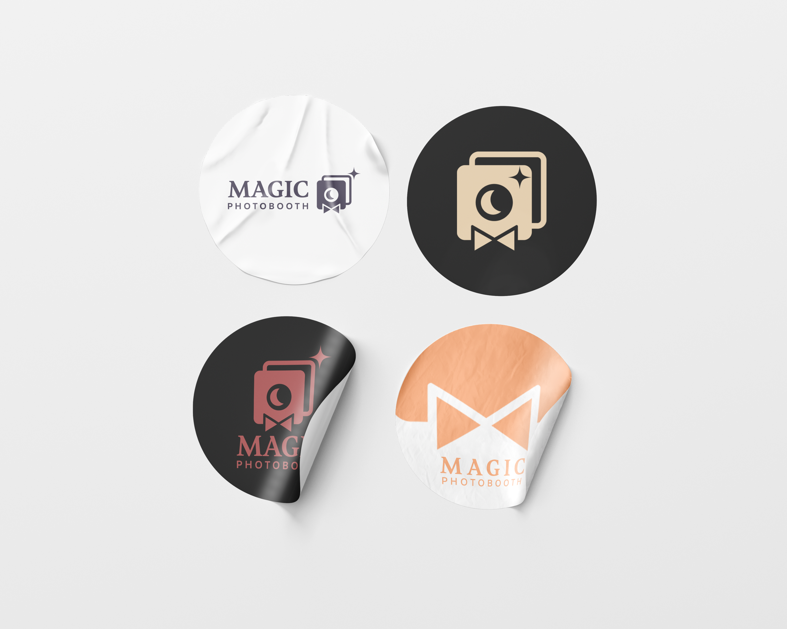
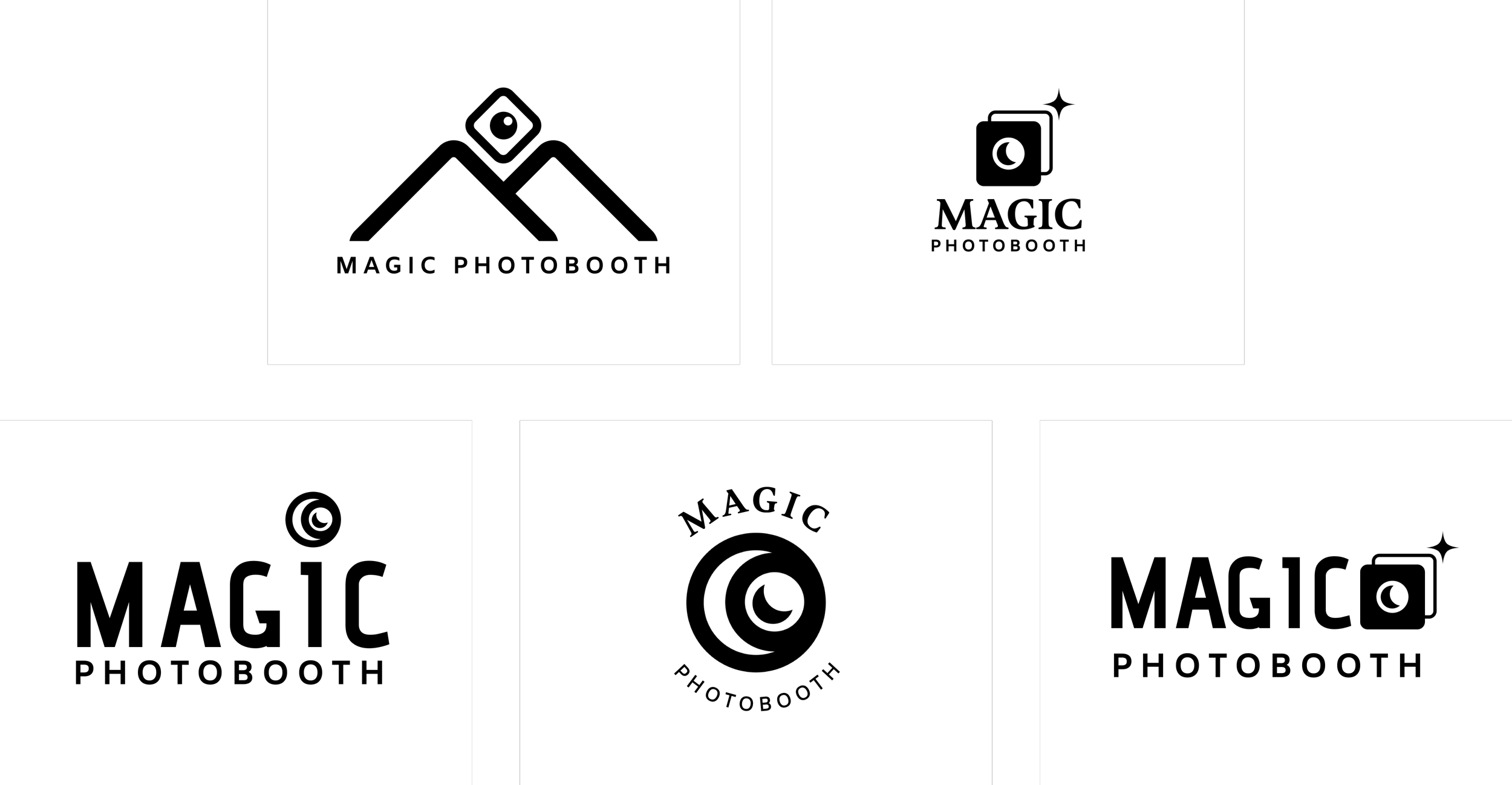
For Magic Photo Booth's visual design, we focused on incorporating motifs of circles and moons. Circles symbolize unity and wholeness, while moons evoke reflection and emotion, akin to a camera capturing precious moments. This symbiotic symbolism invites viewers on a journey of introspection and discovery.
LOGO OPTIONS
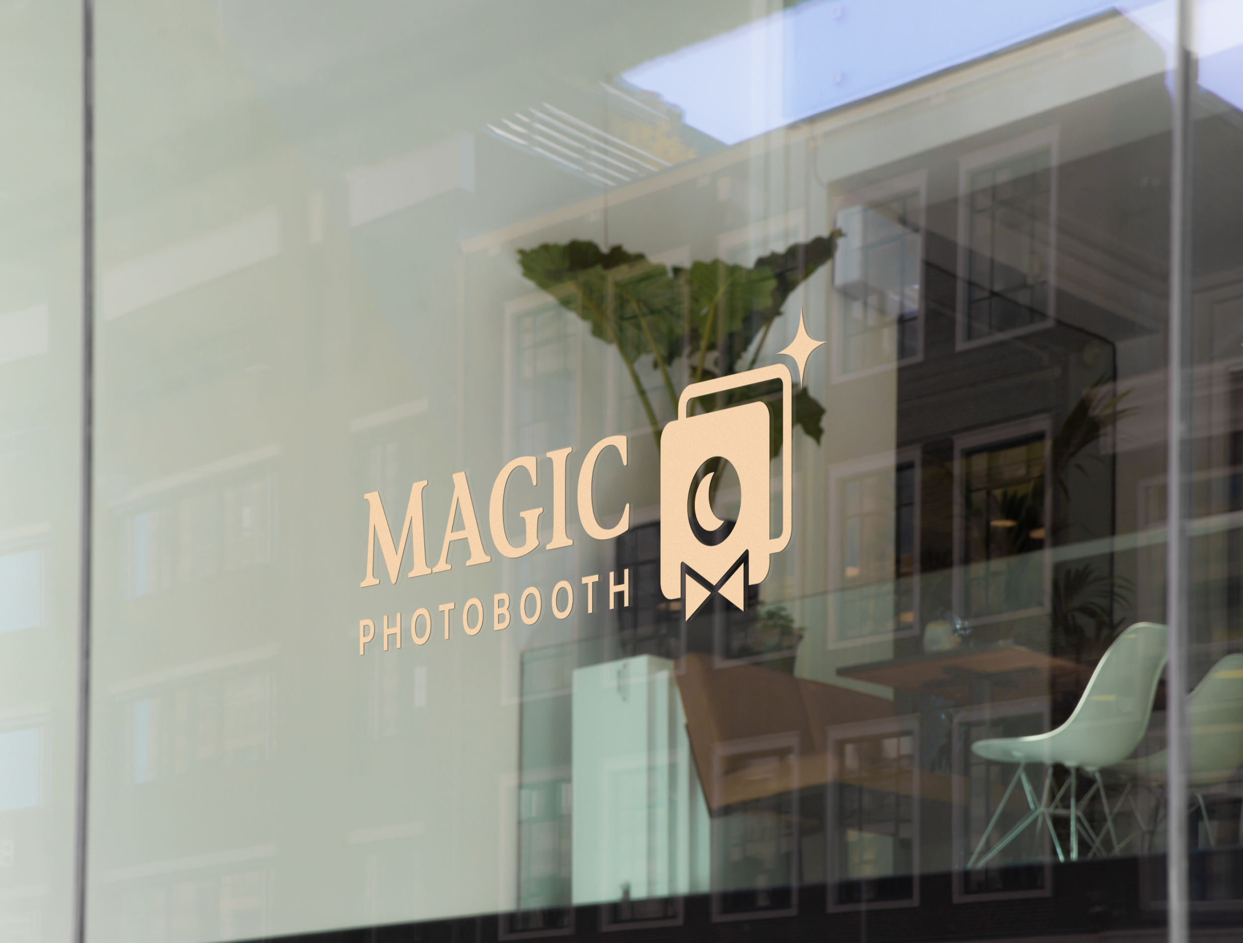
FINAL LOGO + LOCKUPS
COLOUR ANALYSIS
English Violet (#474056): Symbolizing creativity and sophistication, this deep purple hue reflects luxury and elegance, aligning perfectly with Magic Photo Booth's aim to create upscale experiences.
Redwood (#A64646): Representing warmth and vitality, the rich earthy tone of redwood adds vibrancy to the brand's identity, echoing the dynamic atmosphere of photo booth events.
Apricot (#FFAD7A): Bringing brightness and playfulness, apricot symbolizes joy and creativity, creating a welcoming atmosphere that captures the essence of celebration and happiness.
Wheat (#EBD2AD): Offering stability and comfort, wheat provides a soft backdrop to the palette, evoking trust and reliability while maintaining harmony within the brand's visual identity.
