HALO HALO
FOOD CART
Web Design | Visual System Design Refresh | Case Study
Halo Halo Food Cart brings diverse Asian cuisine around Wisconsin, aiming to introduce the community to new flavors. The issue is, marketing relies mainly on word-of-mouth.
Impact: Achieved a six-fold increase in event bookings at the season's outset. Over the year, witnessed a notable improvement in customer confidence and order placement efficiency.
Roles
Product Designer
Deliverables
Developed Website
Refine Brand Strategy
Refined Style Guide
Food Cart Menu
Business Cards
Project Scope
Timeline: Dec - Jan 2023 (4 weeks)
Tools:
Adobe Indesign
Adobe Illustrator
Adobe Photoshop
Figma
Wix
P R O B L E M
Absence of a website hinders the ability to engage and reach the desired audience effectively.
Menu design lacked visual appeal & failed to effectively communicate offerings.
Utilizing social media via Facebook as the website led to challenging navigation.
Inadequate representation of Halo Halo Food Cart's offerings.
Absence of seasonal catering information.
Printed menu posed readability issues for customers.
No provision of business cards for enhanced brand recognition.
R E S E A R C H | D E S I G N P R O C E S S
Challenge: Halo Halo Food Cart had a pre-existing style guide which exhibited some vagueness, prompting the owner's request for a simpler and refreshing approach to be conveyed in their menus + online presence.
Project Initiation: Conducted a thorough review of Halo Halo Food Cart's online and offline assets, identifying a lack of cohesive branding and visually appealing menus. Consulted with the owner to understand business values.
Strategic Intervention: Recognizing the need for a cohesive brand strategy, I formulated a plan to enhance customer engagement. The focus was on addressing readability, visual appeal issues and lack of online social presence.
Outcome: Developed a refined brand strategy, revitalized the website design, and created an aesthetically pleasing and easily legible menu. These interventions aimed to elevate Halo Halo Food Cart's overall brand presence and improve customer interaction.
S T Y L E G U I D E
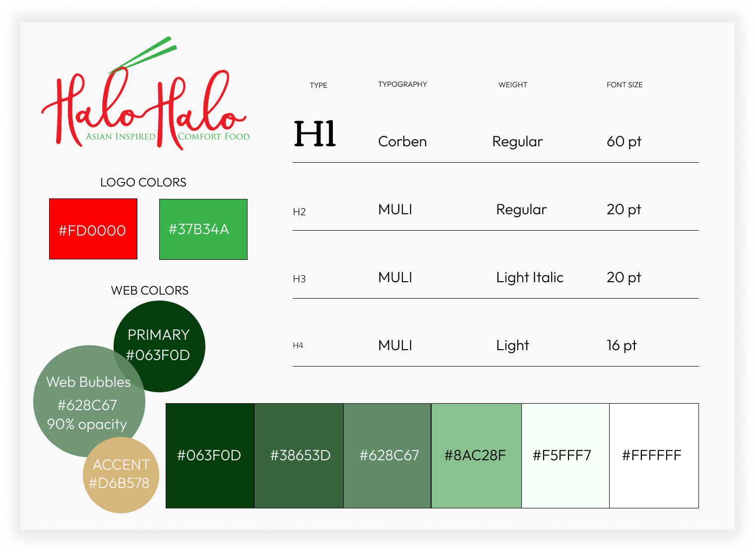
Halo Halo Food Cart lacked a comprehensive style guide and precise color codes for their logo. The initial logo quality required refinement for digital integration, and the original color palette affected legibility. The solution involved selecting a gradient of darker greens to maintain alignment with the existing design, fostering a cohesive and improved brand identity.
D E S I G N G O A L S
Simplicity and Clarity: Craft a straightforward menu design with concise descriptions and ingredient lists.
Mobile-Friendly: Prioritizing a seamless browsing experience on smartphones.
Consistent Branding: Refine and focus the brand identity then apply it to the menu and website design
Mouthwatering Visuals: Feature high-quality images of menu items to entice and influence customer choices.
Effortless Navigation: Create a user-friendly navigation system for swift access to information.
S O L U T I O N
Elevating the online presence with a brand-aligned website with targeted audience engagement.
HOME PAGE
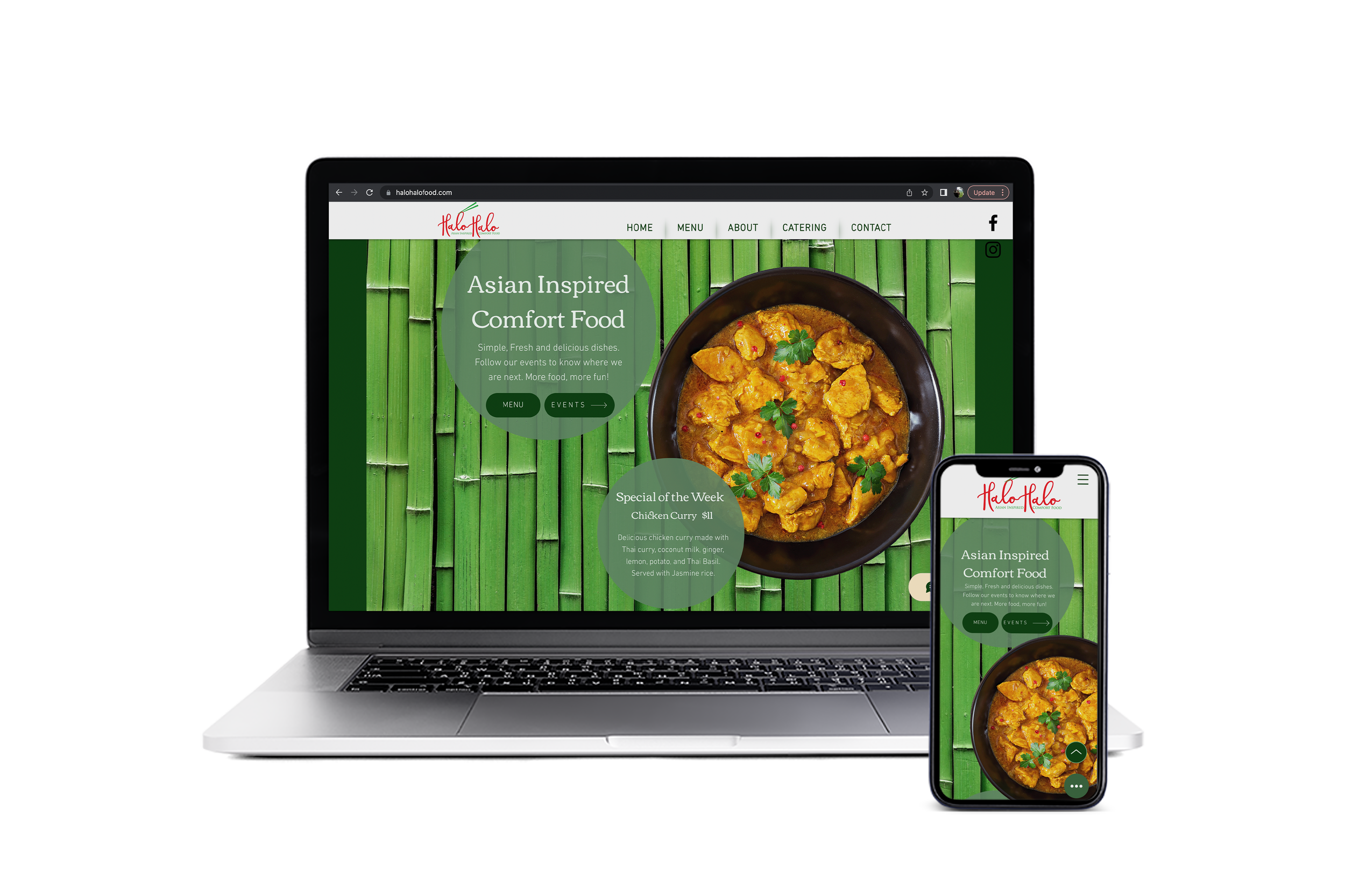
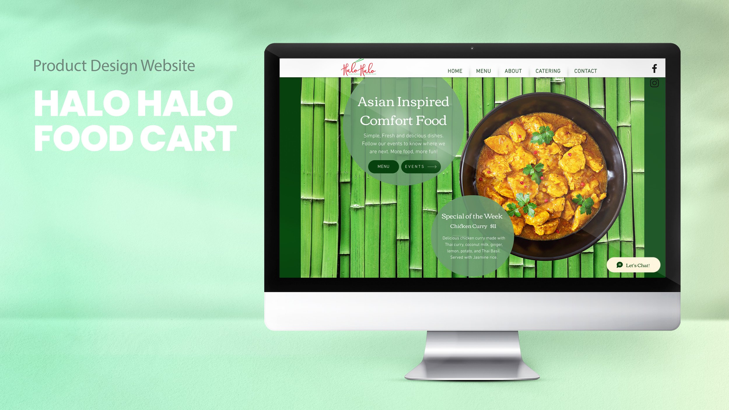
The homepage strategically highlights Halo Halo Food Cart's key features and offerings, with a strong focus on the weekly specials. Clear 'MENU' and 'EVENTS' buttons ensure user-friendly navigation and information.
Strategic Allure: Weekly food specials on the homepage enthrall visitors with captivating visuals and compelling descriptions, fostering a genuine connection and driving active engagement.
Enhanced Navigation: The 'EVENTS' button conveniently delivers location and event details, while the 'MENU' button streamlines access for mobile users.
Culinary Discovery: Successfully piques curiosity, aligning with the brand's objective of introducing new Asian cuisines at Halo Halo Food Cart.
EVENTS PAGE
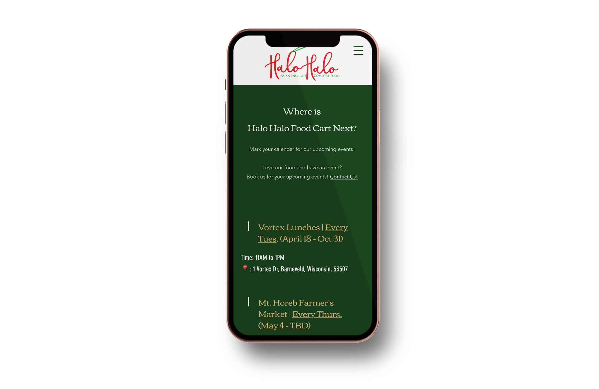
The homepage strategically highlights Halo Halo Food Cart's key features and offerings, with a strong focus on the weekly specials. Clear 'MENU' and 'EVENTS' buttons ensure user-friendly navigation and information.
Brand Credibility: A professional and user-friendly events page enhances the food cart's brand image. Active participation in numerous events solidifies credibility and consistency, appealing to potential customers.
Amplified Social Reach: Easy access to event information encourages users to share on social media, amplifying word-of-mouth marketing and expanding the event's reach.
Strategic Edge: The user-friendly events page establishes a competitive advantage, showcasing a commitment to customer satisfaction and convenience that sets the food cart apart from competitors.
CATERING PAGE
Strategic Revenue Expansion: Integration of catering services diversifies revenue streams, significantly enhancing overall revenue.
Streamlined Client Experience: Online catering offers convenience, allowing clients to easily explore menus, personalize orders, and make inquiries.
Extended Market Reach: The dedicated catering section elevates online visibility, attracting event planners, businesses, and new customers, broadening the food cart's reach.
M E N U
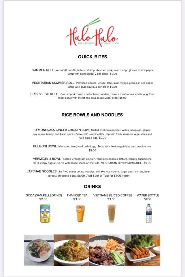
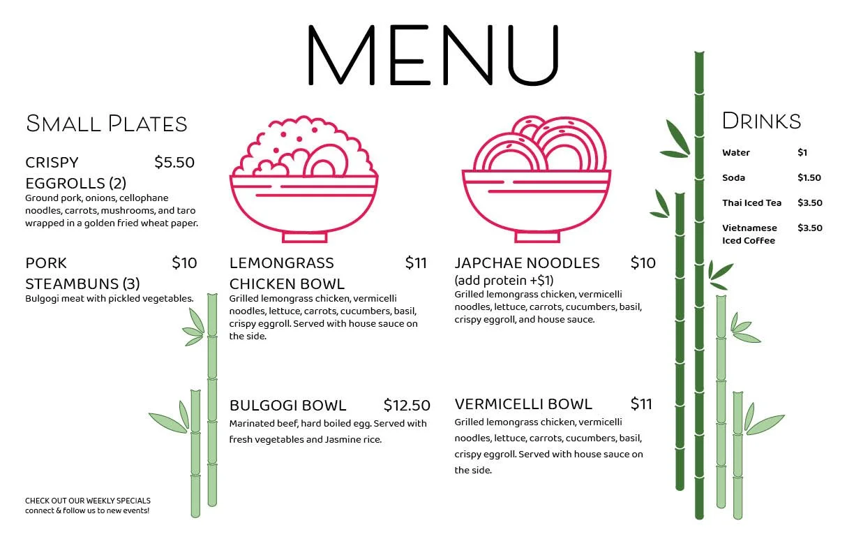
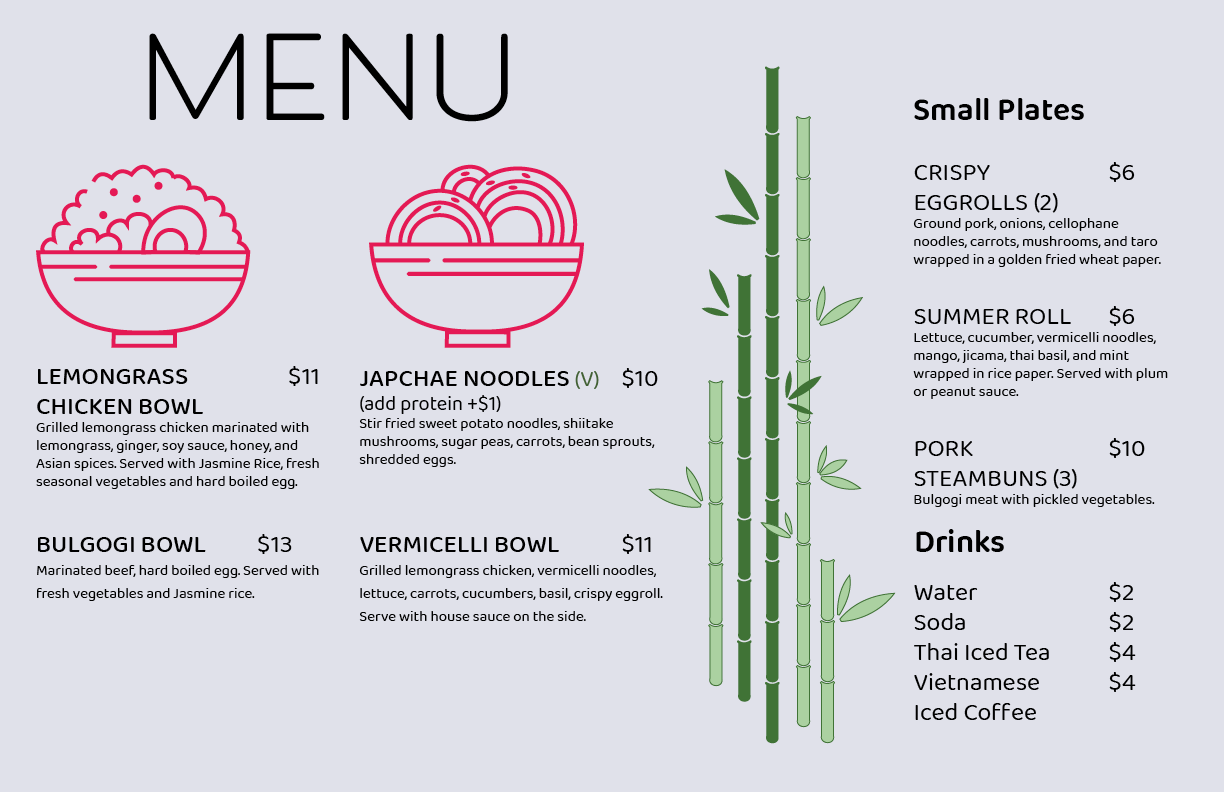
Client Objective: Initially, the client sought a straightforward horizontal menu with illustrations to distinguish food offerings, considering the backdrop of her food cart wrap.
Initial Perception: The client favored a white background for simplicity; however, testing and observation revealed readability challenges, hindering efficient customer ordering. Subsequent refinement prioritized improved legibility in the layout.
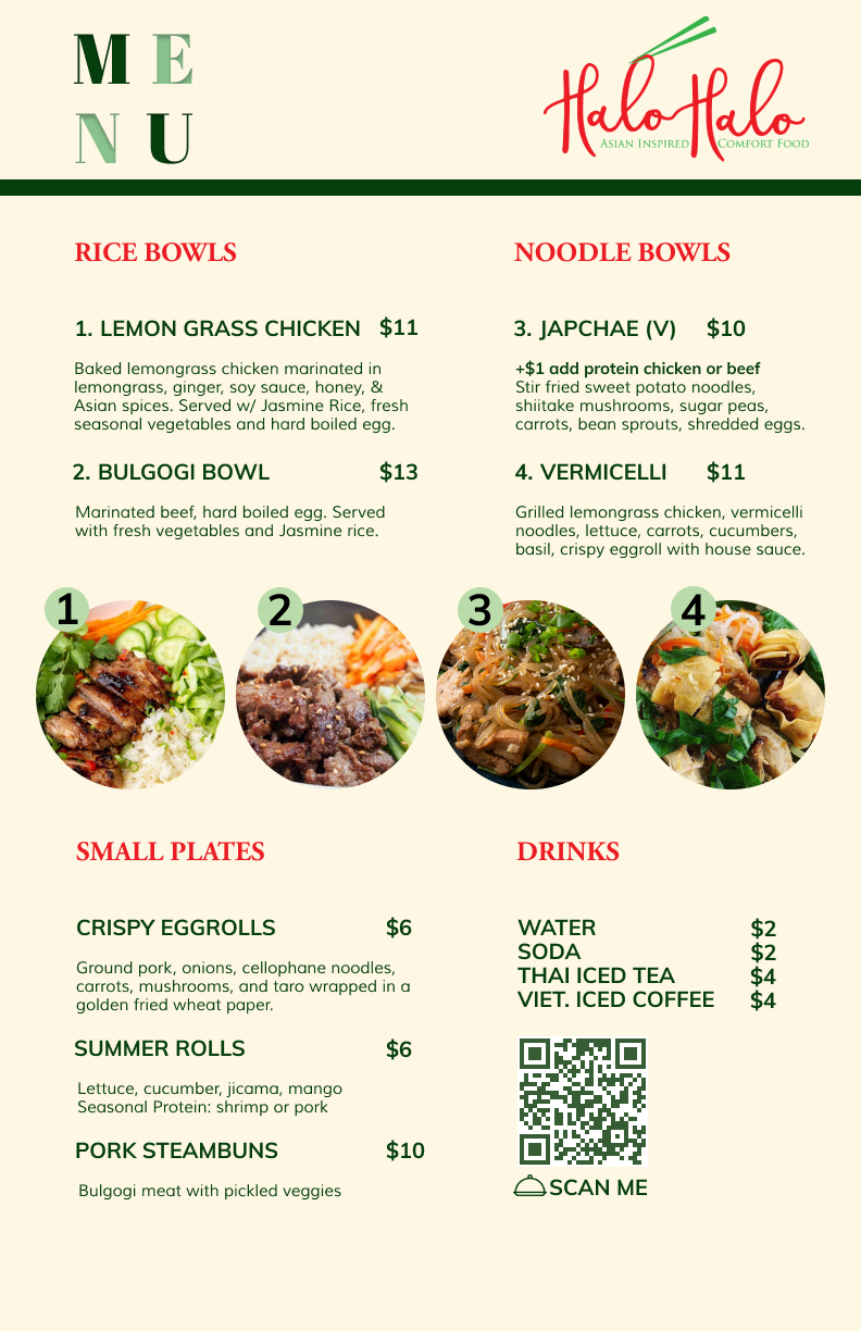
Strategic Design Shift: Despite the client's preference for a horizontal menu, a vertical layout was proposed to overcome challenges associated with horizontal menus. Emphasizing simplicity and brand integration, the vertical menu incorporated visuals for quick decision-making. Additionally, a QR code linking to the website provided access to weekly specials and a mobile-friendly menu.
Introduced Vertical Menu
BEFORE
M A I N I N S I G H T S
Finalized Vertical Menu
Customer-Centric Approach: Research indicated that 90% of customers faced challenges with dish identification and order placement due to nomenclature.
To address this, the new menu integrated dish numbers and pictures. Additionally, a QR code provided quick access to the website, allowing customers in line to view the menu conveniently. Subsequent refinement prioritized improved legibility in the layout.
Boosting Orders & Improving User Experience Through Thoughtful Design
Numbering Asian dishes:
Simplifies choices
Builds familiarity and confidence
Overcomes language barriers
QR code to website:
Interactive engagement
Informed decisions
Reduces perceived wait time
Clear images and descriptions:
Visual appeal and comprehension
Informed choices
Streamlines ordering process
N E X T S T E P S
Enhancing user experience by implementing an e-commerce feature on the website for seamless customer ordering and catering services, including integrated payment processing.
Additionally, optimizing the presentation of the food truck schedule to provide users with a more effective and accessible overview of its locations throughout the week.
Updates (Jan 2024):
The Catering Page now includes a direct link for online ordering, allowing the owner to swiftly process orders and manage billing.
Previously, this feature was withheld as the owner preferred to confirm details with customers beforehand. With increased bookings and confidence, orders can now be placed online, with confirmation to follow.
The Events Page has been revamped into an interactive calendar format, providing customers with a clearer visualization of the schedule.

